REDESIGN · MOBILE
Helping users make decisions and supporting diverse learning environments.
PROJECT OVERVIEW
The goal of this project was to redesign the Udemy app to enhance course exploration and accessibility.

Udemy users faced challenges in selecting courses due to a lack of filters and categorization functions. Additionally, User Interface did not provide support for users who do not speak the language of their instructors.

Through user research and usability evaluations, our team sought ways to resolve these issues.
Project type
Team Project
duration
6 weeks
Role
User Research, User Interview,
UX Design, UI Design, Prototyping, Usability Testing
Tools
Figma, FigJam, Google Survey
PROBLEM
80 percent of users found it difficult to find courses on Udemy.
Despite offering a wide array of courses, Udemy's poor filter and navigation functions made it cumbersome for users to individually check lecture ratings and creation dates.
80% of users said it is difficult to find the right course for them
*As a result of a survey of 20 people between the ages of 25 and 35, which is the main target age of Udemy.
Current user interface.
Our team analyzed the Udemy app and identified the following issues.
  • Crowded UI.
  • Irrelevant information to user.
  • No apparent sorting or filtering categories in the search results.
  • Absence of transcript.
  • Subtitle size cannot be adjusted.
  • To take a course from their wishlist, users must compare them manually.
How might we
1. make course exploration less labor-intensive?
2. make lectures more accessible?
SOLUTIONS
Intuitive
Browse & Search

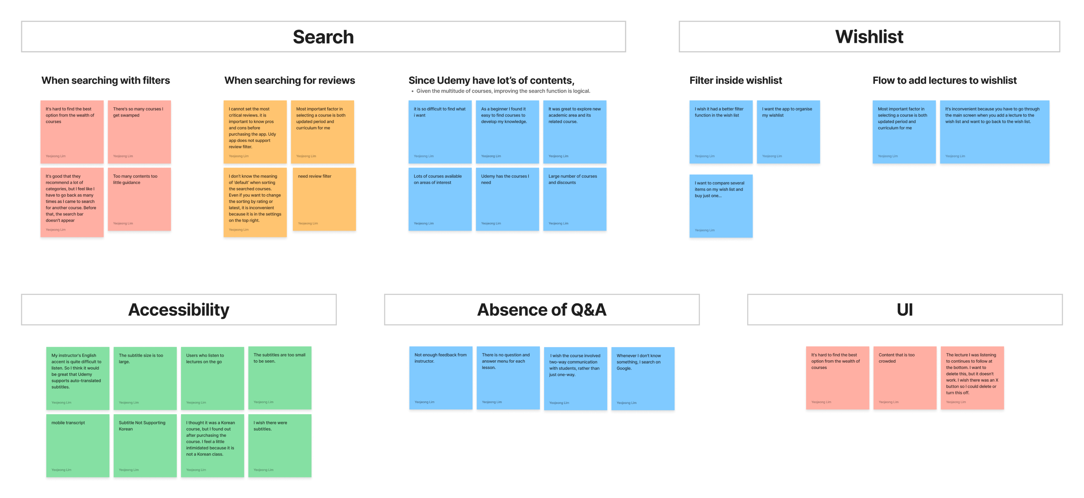
A search bar was added at the top to help users quickly find the courses they need.

We redesigned the search results filter by replacing the filter icon with text labels and displaying filter chips on the results page.

Enhancing Lecture Accessibility

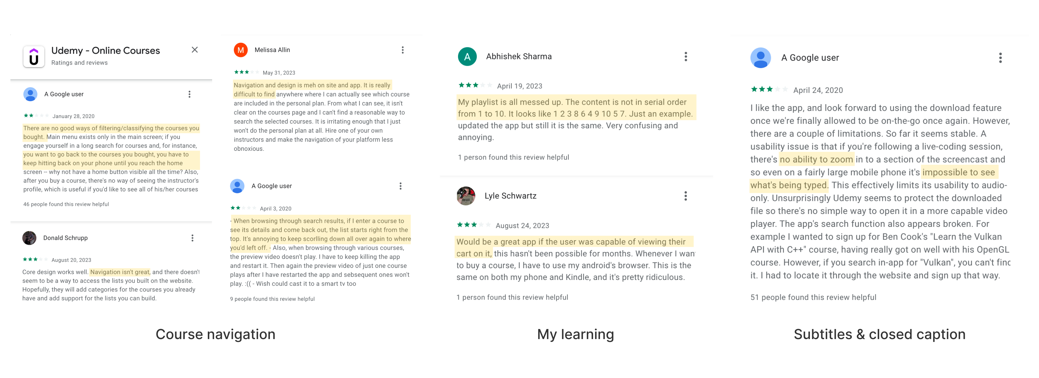
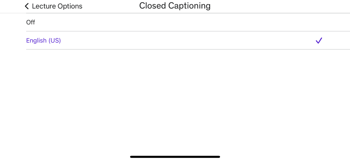
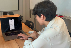
We've introduced a live transcript feature to enhance lecture accessibility, catering to users seeking improved understanding and those with hearing difficulties.

Our aim is to ensure all learners can access Udemy courses regardless of their circumstances, physical abilities, or backgrounds.

Organize Courses with Collections

MyLearning lacked filters, requiring users to manually search through their courses.

To address this, we've  added 'Collections' for categorizing the courses users have taken, making the review process more efficient."

Customizable Captions

For seamless media viewing we added customizable closed captions, benefiting users with diverse visual abilities.

DESIGN PROCESS
User reviews
Reviews highlighted navigation, filters, and subtitles for redesign.
To understand the inconveniences experienced by users of the Udemy application, we identified reviews on Google Play Store and App Store.
Competitor analysis
We conducted competitor analysis to learn how others addressed similar issues we face.
To understand the inconveniences experienced by users of the Udemy application, we identified reviews on Google Play Store and App Store.
User survey
20 global Udemy users in the ages of 25-35 responded.
Results showed that users actively use the search bar and filters to find courses. Many users enter the Udemy app with only a vague idea of their chosen field, and some even listen to courses during their commutes.
User interviews
Deeper understanding of user experiences using udemy app.
In our quest for a deeper understanding of user experiences with the Udemy app, we conducted 40-minute interviews with two individuals to identify pain points.
Some of the questions we asked during the interview were :
  • Why did you start using Udemy?
  • Tell us about your experience using Udemy.
  • Do you have experience using other learning apps / Why did you choose Udemy over other learning apps?
  • How often do you use udemy?
  • How long have you been using Udemy?
  • What do you find most frustrating about Udemy?
  • Overall, how easy to use do you find the app?
  • What were your impressions of the onboarding experience within the app?
  • How would you rate your overall experience on our app?
  • How reliable is the app?
  • If you could improve one thing about the app, what would it be?
  • What is the one thing you wish the app could do that it doesn’t already?
Interview INsights
🤯 The hassle of comparing each course individually.
I've added numerous lectures to my wishlist and am comparing their ratings and reviews one by one to decide which one to purchase.
-Jenny Liu, Content marketer.
🤯 Making purchase decisions based on various factors.
I carefully select courses on Udemy, relying on reviews and star ratings. Especially for design courses, frequent tool updates make it crucial to ensure the course is up-to-date.
-Subin Kim, UI designer.
Affinity map
Categorized user difficulties.
Based on the data gathered from research, we organized the information through affinity mapping. We categorized user difficulties into key areas: search, accessibility, wishlist, and question space and user interface.
2X2 matrix
The priority is easy course navigation.
Results showed that users actively use the search bar and filters to find courses. Many users enter the Udemy app with only a vague idea of their chosen field, and some even listen to courses during their commutes.
Wireframes
In this stage, we focused on interface hierarchy.
After sketching individually, we collaborated to choose the best sketch for wireframing. We each chose our preferred option and gathered feedback and votes from colleagues.
Optimizing space and content.
During the wireframe stage, we selected the content to include after reviewing various sketches. We identified space inefficiencies in the ‘Account’ section.
wireframe annotation
Enhance existing features.
We've introduced two new features that were not available in the existing app. First, we've added a note-taking option to the tab. While previously limited to typing, users can now take notes by speaking and writing. Additionally, we've included a categorization function in 'My Learning' that wasn't present before.
design system
Use consistent colors and components.
Since it was a team project between two people, we decided to produce components to ensure a consistent design.
PROTOTYPE
We created the prototype with the goal of easy search in mind.
We created a process for pressing the magnifying glass button on the home page to search for the desired course field and setting up filters. And more.
Exploring course
Enhanced navigation for purchasing decisions.
Before
Advertisement section takes up a lot of space
No apparent sorting or filtering in the search results.
AFter
A search bar is added.
Users can see and adjust the filters outside of the filter menu.
Before
No sorting features on the lecture page.
AFter
On the lecture page student feedback can be sorted.
A chatbot function that did not exist before has been added.
Taking course
Improved accessibility.
Live transcript to assist users around the world in every situation. And Diversified note-taking modes to support users listening to lectures in various physical settings.
Before
Absence of transcript.
Note function hidden in the more tab.
AFter
A search bar is added.
Users can see and adjust the filters outside of the filter menu.
Previously, it was only possible to turn captions on and off.
AFter
Customize closed captions can assist users with different visual abilities.
Reviewing course
Efficient review with enhanced categorization
In response to user feedback, we added a new category feature to 'My Learning,' addressing the issue raised by a user who noted the inconvenience of using the magnifying glass button to find the lecture they wanted to review.
Before
Courses in an unreasonable order.
Sorting-only filter.
AFter
Users can categorize their scattered courses.
Classify into categories such as career development and hobbies.
USABILITY TEST & FEEDBACK
Task based
interview

We asked participants to complete a series of tasks and observed their behaviour, including their movement patterns and mental models.

Through multiple rounds of feedback, we were able to reduce the cognitive load for users and improve the accessibility of key information.

What I’ve learned
UX research process is essential.

What I learned while working on this project is the importance of research. I researched many user experiences and realized that people’s thoughts differed. I prioritized and scoped what I could redesign the app based on user research. This project helped me learn how to scope and prioritize information.

OverviewProblemSolutionDiscoverDefineDevelopDeliverReflection